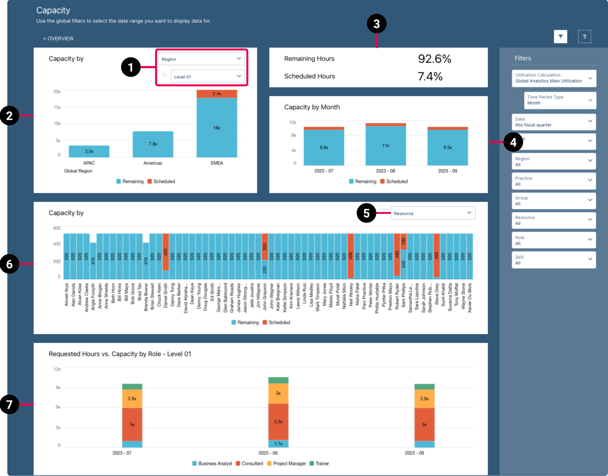
PSA Capacity Dashboard
The PSA Capacity dashboard enables you to:
- View the Remaining Hours percentage KPI.
- View the Scheduled Hours percentage KPI.
- View the PSA scheduled utilization.
- Calculate the total capacity hours data.
- Group the data to view the remaining capacity availability.
The dashboard is created as part of the PS Cloud Advanced Analytics app.
PSA Capacity Dashboard Guide
The PSA Capacity dashboard displays:
- Data for the current fiscal quarter by default
- Only current region, practice and group values for resources

The dashboard displays data from the Capacity dataset. For more details about the fields used in the dashboard calculations, see Billings Dataset PS Cloud Analytics Output Fields.
|
Element Number |
Name |
Description |
Calculation |
Referenced Calculation |
|---|---|---|---|---|
| 1. | View By Picker for Capacity By RPG Bar Chart |
Defines the data displayed in the Capacity By RPG bar chart. |
Capacity grouped by resource region and selected level. | None |
| Capacity grouped by resource practice and selected level. | None | |||
| Capacity grouped by resource group and selected level. | None | |||
| 2. | Capacity By RPG Bar Chart | Displays the total remaining and scheduled hours for the value selected in the view by picker (1). |
Region = Data displayed responds to selections. |
None |
|
Practice = Data displayed responds to selections. |
None | |||
|
Group = Data displayed responds to selections. |
None | |||
| 3. | Capacity KPIs | Total remaining hours and scheduled hours as a percentage. | Remaining Hours = Total Remaining Hours / Total Capacity Hours |
None |
Scheduled Hours = Total Scheduled Hours / Total Capacity Hours |
None | |||
| 4. | Capacity Time Period Stacked Chart | Displays total remaining hours and total scheduled hours by month. | Total Remaining Hours and Total Scheduled Hours grouped by month and value selected in the view by picker (1). |
None |
| 5. | View By Picker for Capacity By Resource, Role, or Skills Bar Chart | Defines the data displayed in the Capacity By resource, role, or skills bar chart. |
Resource |
Displays data by resource.
|
| Role | Displays data by role. | |||
| Skills | Displays data by skills. | |||
| 6. |
Capacity By Resource, Role, or Skills Bar Chart |
Displays the total remaining and scheduled hours for the value selected in the view by picker (5). |
Total Remaining Hours and Total Scheduled Hours grouped by Resource Name, Role Name, or Skill Type. |
None |
| 7. | Requested Hours vs. Capacity by Role - Level 01 Bar Chart | Displays a comparison between requested hours (unheld hours on resource requests) and remaining capacity by level 1 roles. | Total Requested Hours and Total Capacity Hours at Role Level 01, grouped by Utilization End Date = Year-Month and Resource Role, filtered by Capacity Subtype = Remaining, and Has Resource = Yes, or Capacity Subtype = Unheld Hours, Utilization End Date = This fiscal quarter, and Utilization Time Period Type = Month. |
None |
For more information about dashboard functionality, see Using the Dashboards Charts.
Filters
The following filters are available on the PSA Capacity dashboard. For more information about the dataset fields that provide the values for some of the dashboard filters, see Billings Dataset PS Cloud Analytics Output Fields.
|
Name |
Description |
Source of Filter Options |
|---|---|---|
| Date | Select a specific time period to filter by, or select "Custom" to create your own time period to filter by. | Filtered by the Time Period End Date dataset field, but the value from the Time Period Name dataset field is displayed in the picklist. |
| Group | Select the specific groups to filter by, and apply the relevant operators to include or exclude them from the displayed data. | Dataset field: Group Name |
| Practice | Select the specific groups to filter by, and apply the relevant operators to include or exclude them from the displayed data. | Dataset field: Group Name |
| Region | Select the specific groups to filter by, and apply the relevant operators to include or exclude them from the displayed data. | Dataset field: Region Name |
| Resource | Select the specific resources to filter by, and apply the relevant operators to include or exclude them from the displayed data. | Dataset field: Resource Name |
| Role | Select the specific resource roles to filter by, and apply the relevant operators to include or exclude them from the displayed data. | Dataset field: Resource Role |
| Skills | Select the specific skills to filter by, and apply the relevant operators to include or exclude them from the displayed data. | Dataset field: Resource Skills |
| Type | Select the specific capacity types to filter by, and apply the relevant operators to include or exclude them from the displayed data. | Dataset field: Capacity Type |
| Time Period Type | Select the time period type to filter by. Only the time period types for the selected utilization calculation are available for selection. | Dataset field: Time Period Type |
| Utilization Calculation | Select the utilization calculations to filter by. By default, only utilization calculation records with the Is Report Master field selected are available for selection. If required, you can select multiple utilization calculations, but you must ensure that your calculations are configured appropriately to avoid double counting. | Dataset field: Utilization Calculation Name |
For more information about dashboard functionality, see Using the Dashboards Charts.
 SECTIONS