This dashboard is designed to complement the enhanced Services Revenue Forecasting Workspace functionality available in the Fall 2020 release of PSA. For more information on this functionality, see the PSA Help.
The dashboard is available in the following apps:
- PSA Analytics: Revenue Forecast dashboard
- PSA Analytics Embedded Dashboards: Revenue Forecast (Embedded) dashboard
Prerequisites
You must use the Winter 2021 release of Business Analytics to create this dashboard using the PSA Analytics Embedded Dashboards app. For more information on configuring embedded dashboards in PSA Analytics, see Configuring Embedded Dashboards in PSA Analytics.
This dashboard requires access to the following new objects in the Fall 2020 release of PSA:
- Revenue Forecast Version
- Revenue Forecast Version Detail
Access is also required to the following objects available in the Spring 2020 release of PSA:
- Revenue Forecast
- Revenue Forecast Type
This dashboard displays data from the Revenue Forecast dataset. Adjustment data is not included.
This dashboard enables you to:
- Embed analytics to display forecasted revenue broken down by actual, scheduled and unscheduled revenue.
- Review versions of forecasts for your organization within PSA.
- View comparisons of your live forecast against a saved version, or comparisons of two saved versions.
Suggested Use Cases
Explore and visualize the data displayed in this dashboard to answer critical business questions such as:
- How much revenue have we generated to date?
- How much revenue do we expect to generate going forward?
- How much forecast revenue is not linked to scheduled work?
- How accurate has our forecast been compared to our actuals?
Embedding the Dashboard
This dashboard is optimized to be embedded in the page layout for your Services Revenue Forecasting workspace in Lightning Experience.
For more information on how to embed the Revenue Forecast (Embedded) Dashboard, see Embedding PSA Analytics Dashboards in a Lightning Page.
Revenue Forecast Schematics
Refer to the schematics below for details of dashboard elements.
Revenue Forecast Dashboard Schematic 1
Revenue Forecast Dashboard Schematic 2
 2.png)
- Your filter selections determine the data displayed on the dashboard. To set or change your filters, use the following drop-down options:
- Frequency: select the frequency that you want to display your data by. Available options are Monthly or Quarterly. If you select Quarterly, then this follows the offset for the start of your fiscal year. For example, if your fiscal year starts in February, Q1 follows the format Feb, Mar, Apr.
- Period From: select the start date of the time period you want to display data for. Dates available for selection are determined by your Forecast Version selection in the Overview chart. By default, this date is set to the current month.
- Period To: select the end date of the time period you want to display data for. Dates available for selection are determined by your Forecast Version selection in the Overview chart. By default, this date is set five months on from your current month.
- Project: select the project you want to filter the data displayed in your dashboard by.
- Project Manager Name: select the project manager name you want to filter the data displayed in your dashboard by.
- Opportunity: select the opportunity you want to filter the data displayed in your dashboard by.
- Account: select the account you want to filter the data displayed in your dashboard by.
Region, Practice and Group Filters
- Region Level: select the Regional Level you want to filter your data by. Selections here determine the region options displayed under "Region".
- Region: select the Region you want to filter your data by.
- Practice Level: select the Practice Level you want to filter your data by. Selections here determine the practice options displayed under "Practice".
- Practice: select the Practice you want to filter your data by.
- Group: select the Group you want to filter your data by.
- Group Level: select the Group Level you want to filter your data by. Selections here determine the practice options displayed under "Group".
Revenue Forecast Dashboard Elements
The Forecast Variance Pill
The Forecast Variance pill uses the Forecast Version to Compare as the baseline.
The Forecast Variance is automatically calculated by the pill by subtracting your Forecast Version to Compare from your Live Forecast Version to derive your Variance.
Your % Variance is the percentage change between the baseline of Forecast Version to Compare and your Live Forecast Version.
By default, variances with a value of zero will not be displayed in this chart as there will be no variance to display.
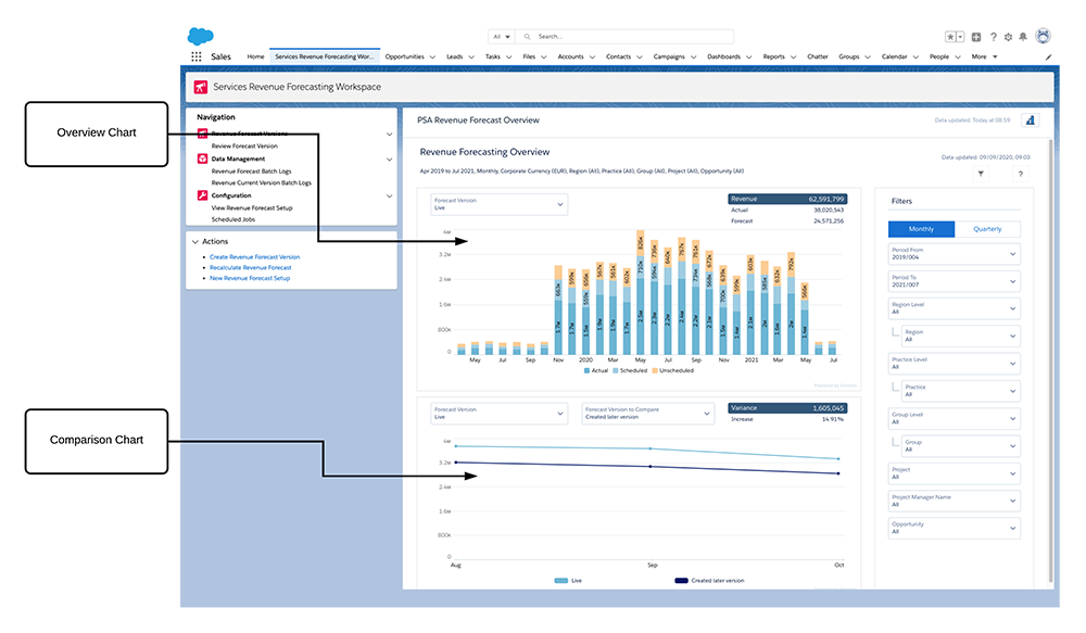
The Revenue Forecast dashboard contains the following pages, charts and tables:
Page | Chart | Type | Description |
|---|---|---|---|
| Summary | Overview | Stacked Bar Chart | Displays actual, scheduled and unscheduled revenue for your selected time periods. Available forecast version options are:
Selections made with the Forecast Version drop-down menu determine the start and end dates available for selection in the global filter panel. Selections made with the Forecast Version drop-down menu in this chart are reflected in the Forecast Version drop-down menu in the Comparison chart. The total revenue amount for your selected period is displayed in a health indicator pill at the top of this chart, along with Actual and Forecast revenue values.
|
| Comparison | Line Chart | Displays a comparison between the forecast selected in the Overview chart and the forecast selected in this chart. This chart only displays data points within your selected date range where both the forecasts selected for comparison have available data. Available forecast versions for comparison are:
The variance between your selected forecast versions for comparison is displayed in a health indicator pill at the top of this chart, expressed as revenue value and as a percentage. | |
| Details | Revenue Trends | Stacked Bar Chart | Displays a comparison between your Live Forecast and your Forecast Version to Compare, and the percentage variance between these forecasts. Data in this chart is filtered by the following options in the chart drop-down menu:
|
| Variance by | Bar Chart | Enables you to filter the variance between your Live Forecast and your Forecast Version to Compare by using the following options from the chart drop-down menu:
A second drop-down menu enables you to select the level at which Region, Practice, or Group are filtered. Selections made within this chart facet the data displayed in the Revenue Trends chart. | |
| Variance by | Bar Chart | Enables you to filter the variance between your Live Revenue Forecast and your Revenue Forecast Version to Compare by using the following options from the chart drop-down menu:
A second drop-down menu enables you to select the time period for which this is displayed, be it quarterly or monthly. You can also view the Top 5 and Top 10 results per option. | |
| Resources | Table | Displays the following columns:
You can also drill down from the milestone column to gain more insights into the specific account. To order columns displayed in the this table, hover over the column header and click |
 .
.Faceting in the Revenue Forecast Dashboard
Faceting is available between the various charts and tables available for the Revenue Forecast dashboard.
For example if you select an element in the forecast chart, this filters the following detail charts to provide more insight into that record.
Faceting in the Revenue Forecast dashboard also works in reverse. If you select a record in the detail charts, for example - one specific region, this filters the overall chart.
 View Tutorial